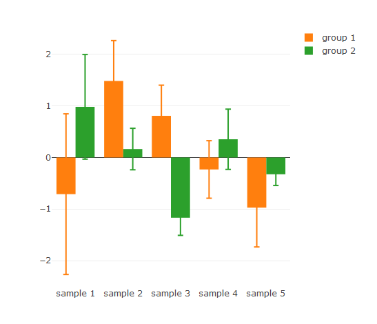
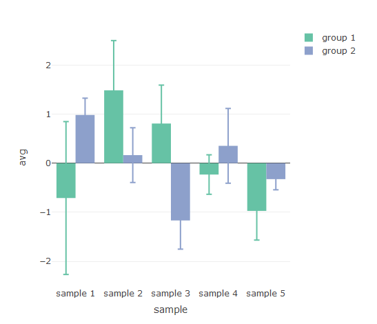
Plotly is a great plotting library that I’ve started to use extensively in part due to the ease in connecting graphs together under R. There is, however, a bug when using error bars in conjunction with a group variable - error bars are not drawn in the correct order. This can be fixed with a hack by adding each group as an individual trace.
library(plotly)
library(dplyr)
library(tidyr)

## Raw data
df <- data.frame(sample = rep(paste0('sample ', 1:5), 4),
                 x = rnorm(20),
                 group = rep(paste0('group ', 1:2), each = 10),
                 stringsAsFactors = FALSE
)

## Stats table
df2 <- df %>%
  group_by(sample, group) %>%
  summarise(avg = mean(x), sd = sd(x)) %>%  ungroup()
| sample | group | avg | sd |
| sample 1 | group 1 | -0.7109844 | 1.5580422 |
| sample 1 | group 2 | 0.9824275 | 1.0144322 |
| sample 2 | group 1 | 1.4844481 | 0.7831823 |
| sample 2 | group 2 | 0.1637073 | 0.4021972 |
| sample 3 | group 1 | 0.8079739 | 0.5945598 |
| sample 3 | group 2 | -1.1680917 | 0.3423773 |
| sample 4 | group 1 | -0.2322471 | 0.5579732 |
| sample 4 | group 2 | 0.3531852 | 0.5845086 |
| sample 5 | group 1 | -0.9730660 | 0.7619741 |
| sample 5 | group 2 | -0.3258866 | 0.2172091 |
## Plotly barchart with error bars.  Error bars are incorrectly assigned
p1 <- plot_ly(df2, x = ~sample, y = ~avg, color = ~group, type = 'bar', error_y = list(array = ~df2$sd))
p1
## Create individual columns for group data and errors
df3 <- df2 %>%
  gather(key, value, -c(sample, group)) %>%
  mutate(ref = paste0(group, ifelse(key == 'sd', '_sd', ''))) %>%
  select(-group, -key) %>%
  spread(ref, value)

## Plotly barchart displays error bars correctly
p2 <- plot_ly(df3, type = 'bar')
for (g in unique(df2$group)) {
  p2 <- add_trace(p2, x = df3[['sample']], y = df3[[g]], name = g, error_y = list(array = df3[[paste0(g, '_sd')]]))
}
p2